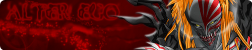
Made for some friends of mine, we're starting an abridging group.
So this here is going to be the site's banner, version 2:
^Looks much bigger on the site!^
The site can be found here.
What do you think of this Site Banner?
Last edited by Challokas on June 30th, 2010, 8:22 am, edited 1 time in total.
Re: What do you think of this Site Banner?
It's good, I won't say it isn't.
I'm not good with graphics so I can't tell you what you can do to improve
or what's good about it but...
I can tell you that the font looks a little "tacky" D:
otherwise like I said, it's good ^.^
I'm not good with graphics so I can't tell you what you can do to improve
or what's good about it but...
I can tell you that the font looks a little "tacky" D:
otherwise like I said, it's good ^.^
Re: What do you think of this Site Banner?
i would say that the leaf can be alittle smoother at the edges :)
that pretty much all i can find :D
Re: What do you think of this Site Banner?
if i was you, I'd put a glow radiating out of the text to make it more legible...not something big, just a gentle white glow...otherwise it looks good :)
Re: What do you think of this Site Banner?
me likey :D
- Wolfbrother0
- Posts: 69
- Joined: May 7th, 2010, 12:32 am
Re: What do you think of this Site Banner?
hard to read.